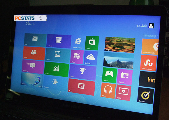
Touch screen Windows 8 notebook
After first powering up the Samsung NP540U3C-A01
ultrabook Windows 8 will lead you through a short set of screens
to identify its peculiar menu placements and familiarize first time touch screen users with the
new interface. After that, touch screen proficiency comes pretty naturally.
Novice users shouldn't need any instructions
as the interface is essentially self explanatory - if you can
use an iPad, you'll have no problems here. The touch
screen nicely compliments the mouse and notebooks' touch pad; it's a better
tool for the job in specific instances, but not a replacement for the speed of
a keyboard keyboard nor the precision of a mouse.
It's best put this way - the touch screen expands what
the notebook can do and what you can do with the notebook. A touch screen is
an intuitive way to browse long website pages, to quickly tap IEs back button, move windows
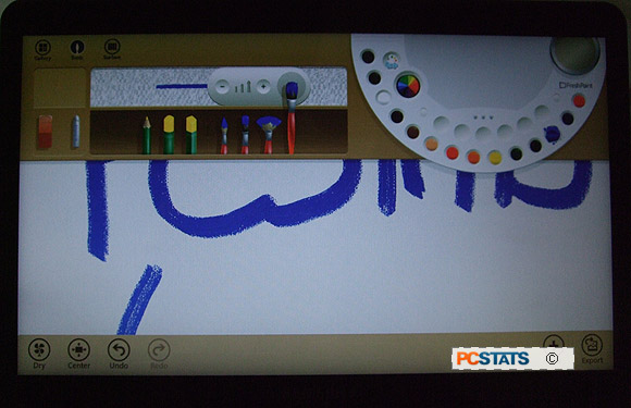
around the screen, finger paint with some of Microsoft's newer Apps and essentially augment tasks
previously focused around the touch pad or mouse.
|

Microsoft's new
finger painting app. This one is for the kids.
|
The touch screen is a better interface tool in many
instances but it is absolutely not a replacement for a keyboard and mouse. Let's
spill some pixels talking about the Samsung NP540U3C-A01's touch screen; where
it rocks, where it falls short and how the Windows 8 touch screen interface stands
up against expectations created by Apple's ubiquitous iPad.
Touch Screen - First Impressions
While Apple's
iPad is several orders of magnitude below what a
notebook like the Samsung NP540U3C-A01 is technically capable of, the iPad does have
that benchmark setting touch screen interface. Chances are you've used
an iPad, so you know the iPad touch screen is intuitive and
not cluttered by administrative menus along the edges of the screen.
Scrolling and zooming features work well on the iPad, but highlighting
text and copying and pasting, not so much.
With Samsung's NP540U3C-A01 Ultrabook and more
specifically the Windows 8 touch interface, the reverse is sort of true.
Scrolling up and down long website pages is generally much quicker by flicking
the screen. There's also a whole world of new paint programs for kids and
swiping through the Metro interface is pretty neat. All this good
stuff is tempered by several reoccurring issues and an overabundance of
Windows system menus that get in the way and make the touch interface on a
notebook way more complicated that it really ought to be.
In no particular order, here are some observations
from PCSTATS first experience with a first generation touch
screen notebook as we put it though its paces.
- How do you interact
with a touch screen that's not a
tablet? - On a notebook there
are really only three edges of the display accessible to the
user, of these only the left and right sides of the screen are practical to
handle. This tends to concentrate most of the users' finger actions along the left
and right sides of the screen where Windows 8 inconveniently has most of
its system control menu's located. As a result, touch
screen navigation in Windows 8 inadvertently activates too many
system and command menus (at least in our trials with it). For
example, the right-side Windows 8 menu was constantly flying out into the
screen when we didn't want it too. Very annoying.
- Websites Zoom in when you try to
scroll down - I'm not sure if it's because we paused with a finger on the screen, or flicking
down (to scroll a webpage) mimicked some Win 8 gestural command,
but the touch screen was constantly zooming in when we didn't want
it to. This even happened when only one finger was interacting with the
display. Doubly annoying.
- How do you handle a tablet-notebook? -
Laptops and tablets are held differently because how we interact with
keyboards and screens is different. The challenge is, how do you hold a laptop with
a tablet screen? Holding a laptop screen by the sides, as you would a tablet,
doesn't work very well when there is a weighty keyboard attached to the bottom
of the screen. If you're laying back on a chair or couch for example,
the touch screen is the easiest way to casually nose around the internet.
The thing we discovered is that you just can't handle a touch
screen notebook like you would tablet, even though you can interact with
the screen in the same way. The two formfactors may have been blended, but
don't treat the Samsung NP540U3C -A01 like an iPad. Treat it and handle it like
a notebook and your user experience will be better.
|

|
- Windows 8.... -
Microsoft Windows 8 is
an asinine operating system with a GUI and menu system that will systematically
drive an entire generation of computer users back to paper and pencil.
More to the point, our enjoyment of the Samsung NP540U3C-A01's wonderful hardware
side was severely crippled by Microsoft's ineffective new user interface. Needless to say, I've developed a pretty strong
negative opinion of Microsoft Windows 8 after using Samsung's beautiful little ultrabook for a couple
weeks, however it's unfair to rant about
Windows 8 shortcomings that can be chalked up to personal taste, so I won't. If
you like
Win 8, I tip my hat to you - this Ultrabook is built with
it in mind.
- Screen doesn't tilt back far enough - The
screen doesn't bend back especially far and since there is a glossy touch screen
panel in front of the LCD, there are times when rear lights are reflected in the
screen making text too difficult to read.
Clearly, there are times when a touch screen is the most
intuitive method to manipulate data or navigate a website, as countless
finger printed monitors over the last 30 years can attest to. The Windows 8
touch screen interface gets it about 70% right. I'd be more interested in the
2nd Generation interface whenever that is released, though.
Let's crack this Samsung 5-series Ultrabook open for a quick
look under the metal chassis.
