Internet
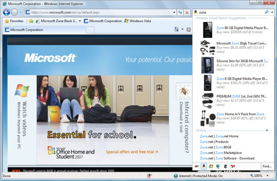
Explorer 8 also works and looks a bit different than its predecessor. The new
address bar is better at predicting text entries, and matches what you typed with
suggested information and a history of previous searches and typed-in URLs.
Firefox's Awesome Bar and Google Chrome's Omnibar have similar functionality. While IE8 does
a great job of grouping all of its information together, Firefox and Chrome
seem to better differentiate between when you want to do a search, and when you
want to go directly to a URL.

It's somewhat more difficult to customize Internet Explorer 8's theme or panel layout when
compared to its rivals. The default icons have been moved to make room for a new style
of tabbed browsing, and certain menus can be hidden or removed with the click of
a button. Microsoft makes it difficult to change the positions of individual
buttons or re-skin the entire Internet Explorer interface.

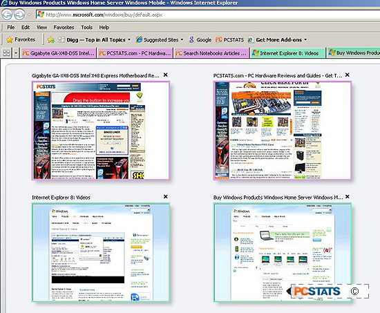
The browser Tabs have received an overhaul
since they were first introduced in Internet Explorer 7. Tabs that are open
are now grouped and colour coded if they're all new tabs from a single parent.
In other words, different 'families' of tabs are grouped together in
similar colours schemes, making it easier to keep track multiple tabs spawned
from say PCSTATS or Google searches.

Tabs
can also be displayed in Quick Tab mode, which provides an overview of
every tab on a single page.

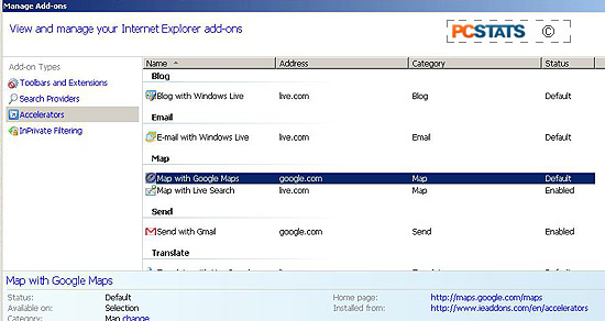
When a
brand new tab is created, Internet Explorer 8 displays a custom generated page
that lists recently closed tabs, options to change the browsing mode, and quick
links to installed Accelerators or add-ons.

It's really nice to see how well Internet Explorer 8
has embraced tabbed browsing, especially in the light of comments just a few
years ago when Microsoft claimed that users 'didn't want tabs'.

IE8's native tabbing abilities surpass that of the rival Firefox and Opera
browsers, although similar functionality can be added to the latter browsers via
extensions.
